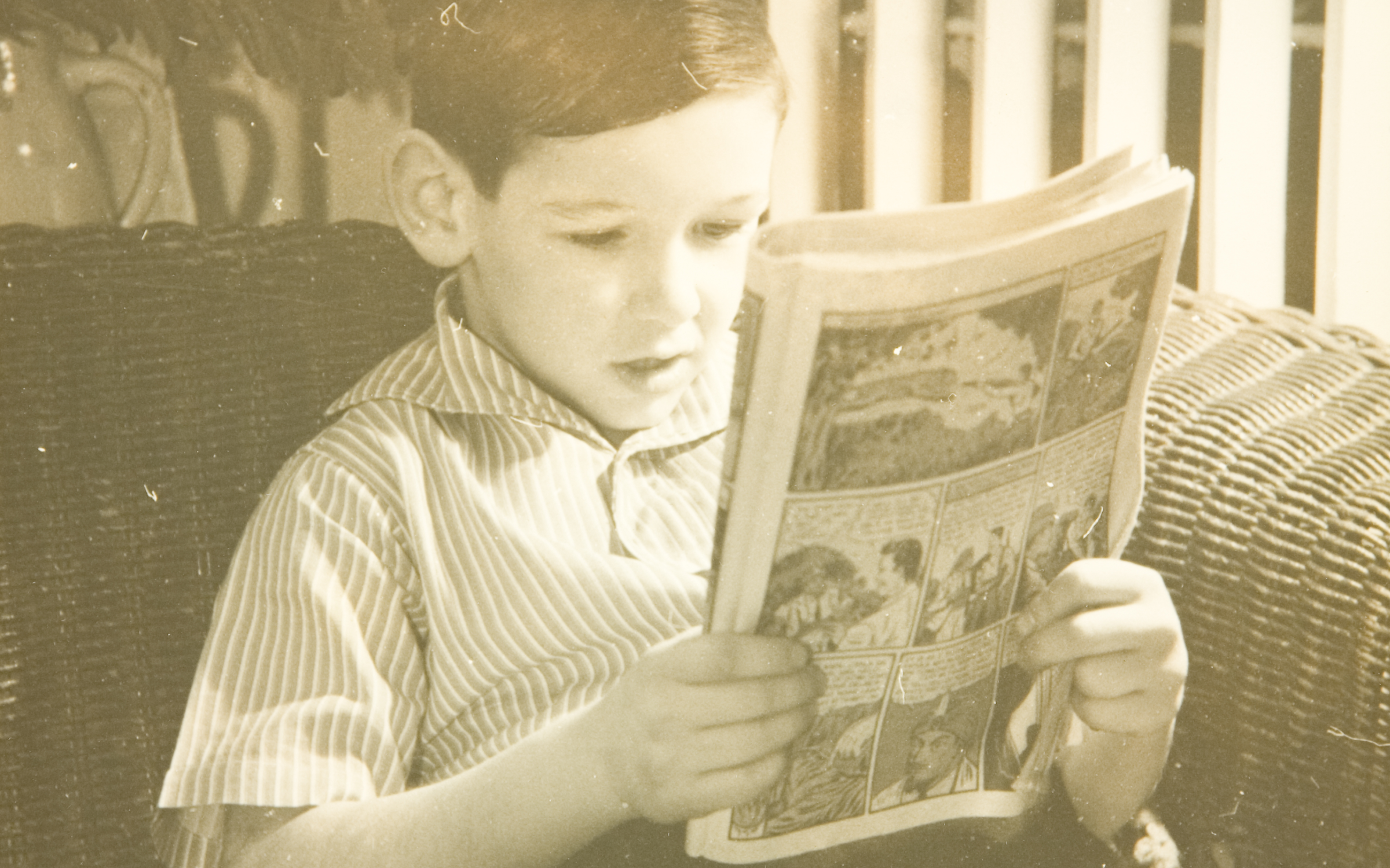
By J. Attridge, UMFA communications coordinator
The definitional borders around fine art or ‘high art’ can be blurry and there are many differing opinions regarding what qualifies. For some, it may seem that the differentiation is as simple as fine art being fancy and valuable and low art being everything else, but of course, it is more complicated than that. I consulted an expert in European and American art and the senior curator at the UMFA, Alisa McCusker.
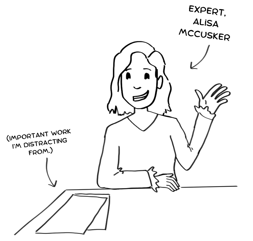
“It’s really hard to define fine art. We are the Utah Museum of Fine Arts so what does that mean?” McCusker said. A hundred years ago the answer would have included “painting, and sculpture, and printmaking but not all printmaking, and drawing, but not all drawing” as high artforms, but the definition of fine art is evolving. “Artists are always challenging us on what [fine art] means.” According to McCusker “In older definitions, people would have thought of fine art as ‘art for art’s sake’ that it exists purely for visual enjoyment, it looks pretty, or that it’s something pleasing to look at in somebody’s home or somebody’s fine art collection.” On the other hand, McCusker described “applied art [as] usually something that has some kind of functional or utilitarian purpose. Furniture design, wallpaper, one could even say book layout- book design, wrought iron fences, things like that [would be considered applied art or craft] ... I think those definitions are collapsing into each other... The suggestion that something has a function, or a utilitarian use undermines it as art? It just doesn’t really hold true. Because the question that art historians and architectural historians are trying to get at is “Why does this look like this?” so the questions of visual analysis are all the same. And in some ways applied art can tell us more about cultural context than fine art can.”
Defining what comic art is seems much more straightforward. You can look at a page with illustrations and speech bubbles and easily identify a comic. But when you start to break down the unique elements of comic art, it becomes more complicated. Generally, a comic requires illustrations, speech and/or thought bubbles, and the art typically has to be sequential in order to be understood. But there are so many exceptions to these “rules” that a true definition becomes nearly impossible to settle on. Some comics have no words at all but are sequential and tell a story entirely through visual art. Some comics are only a single illustration with a caption. Though notably Scott McCloud excludes single-panel images such as Family Circus and The Far Side from the definition of comics in Understanding Comics arguing that comic art “is a language” and consists of “juxtaposed pictorial and other images in deliberate sequence.” To some the sequential nature of comic art is foundational, to others sequential art is only one of many styles comic art may take. With comics, sometimes you just have to know it when you see it, and they can take many different forms.
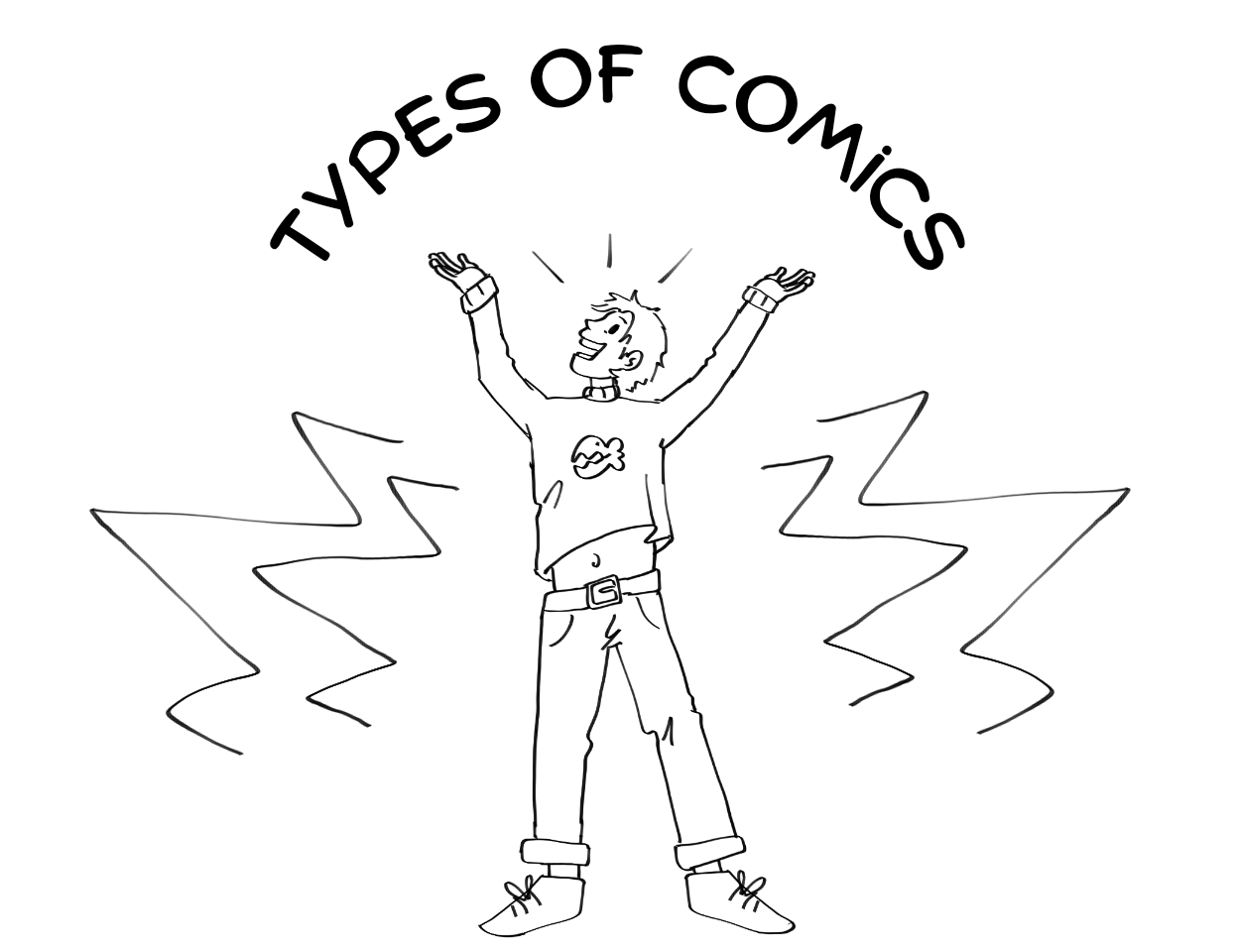
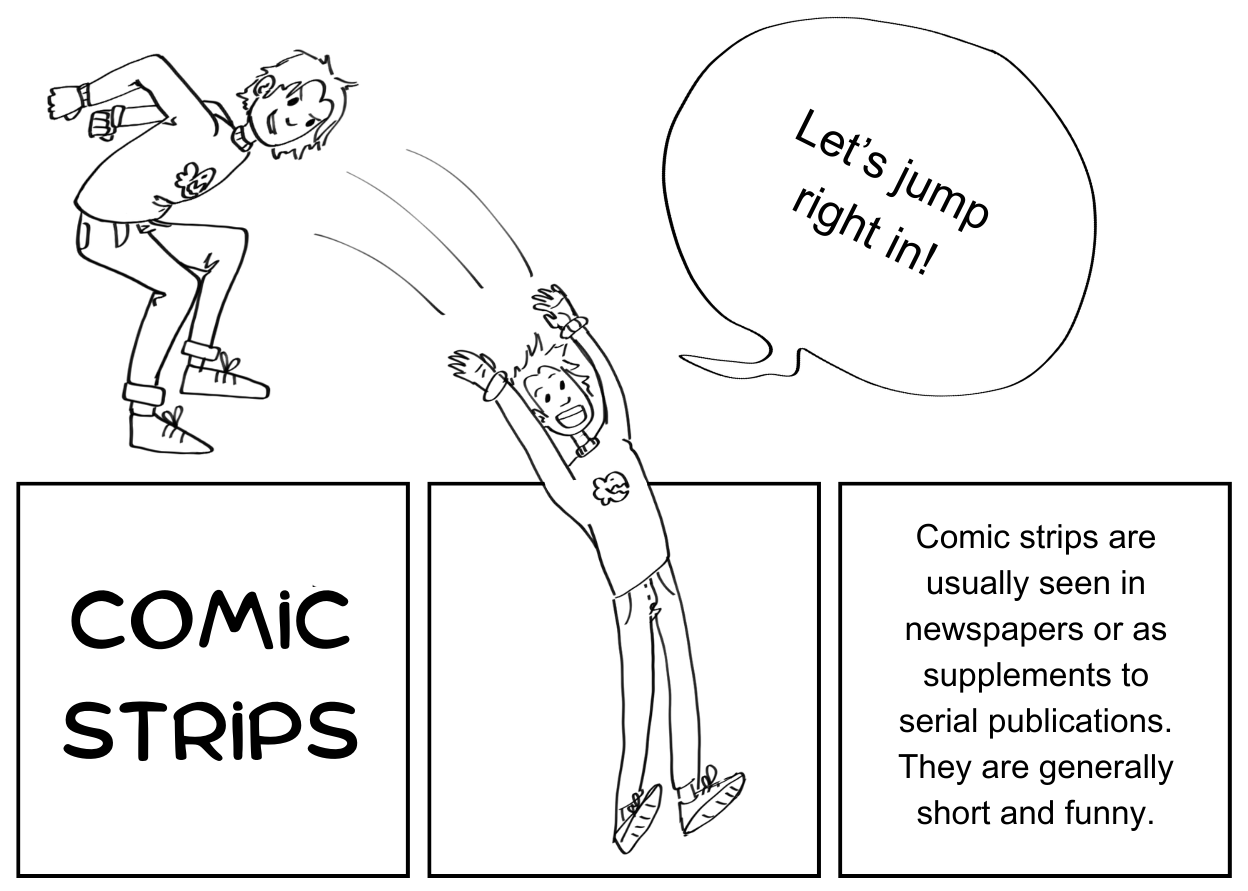
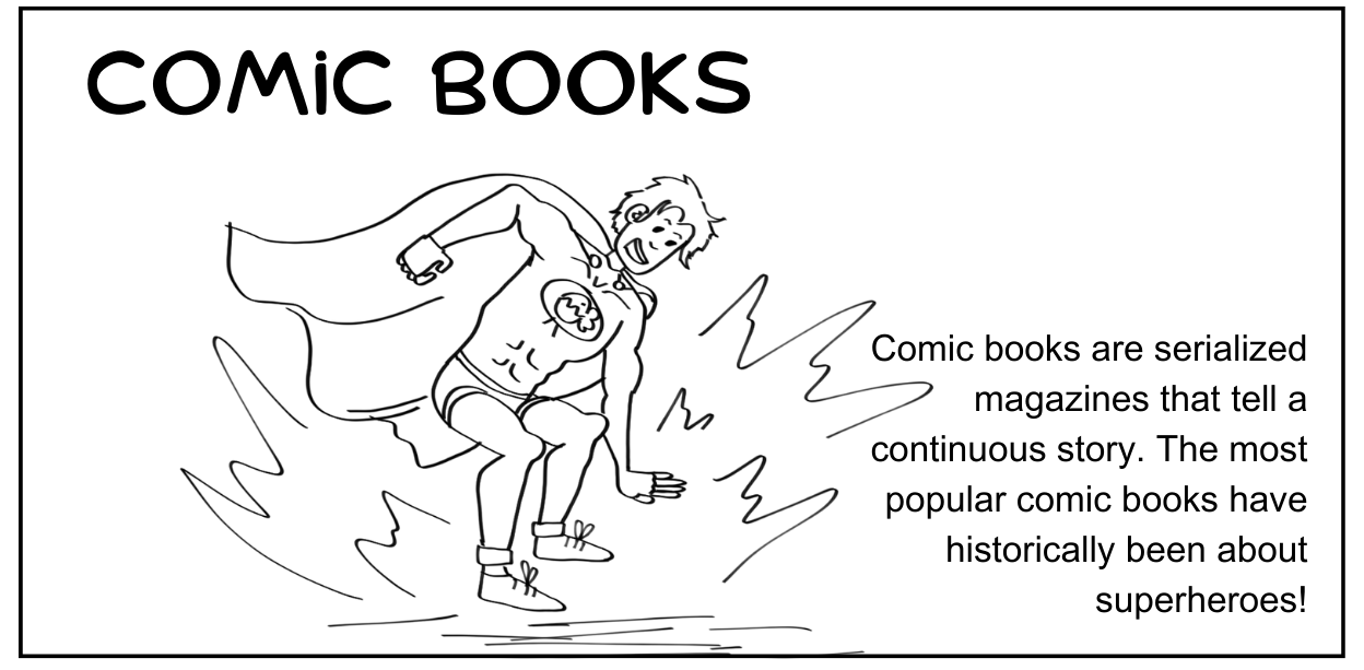
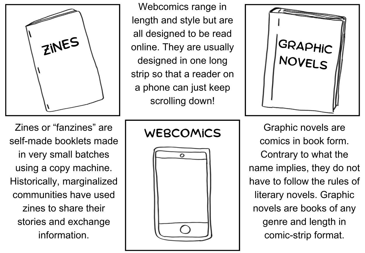
Despite the name, not all comics are intended to be funny; in fact, English is the only language where the word ‘comic’–or words of similar meaning–are used in connection with this art form. This can be misleading since many of the examples of pre-20th century comic art were far from humorous, even darkly morbid as moral satire.
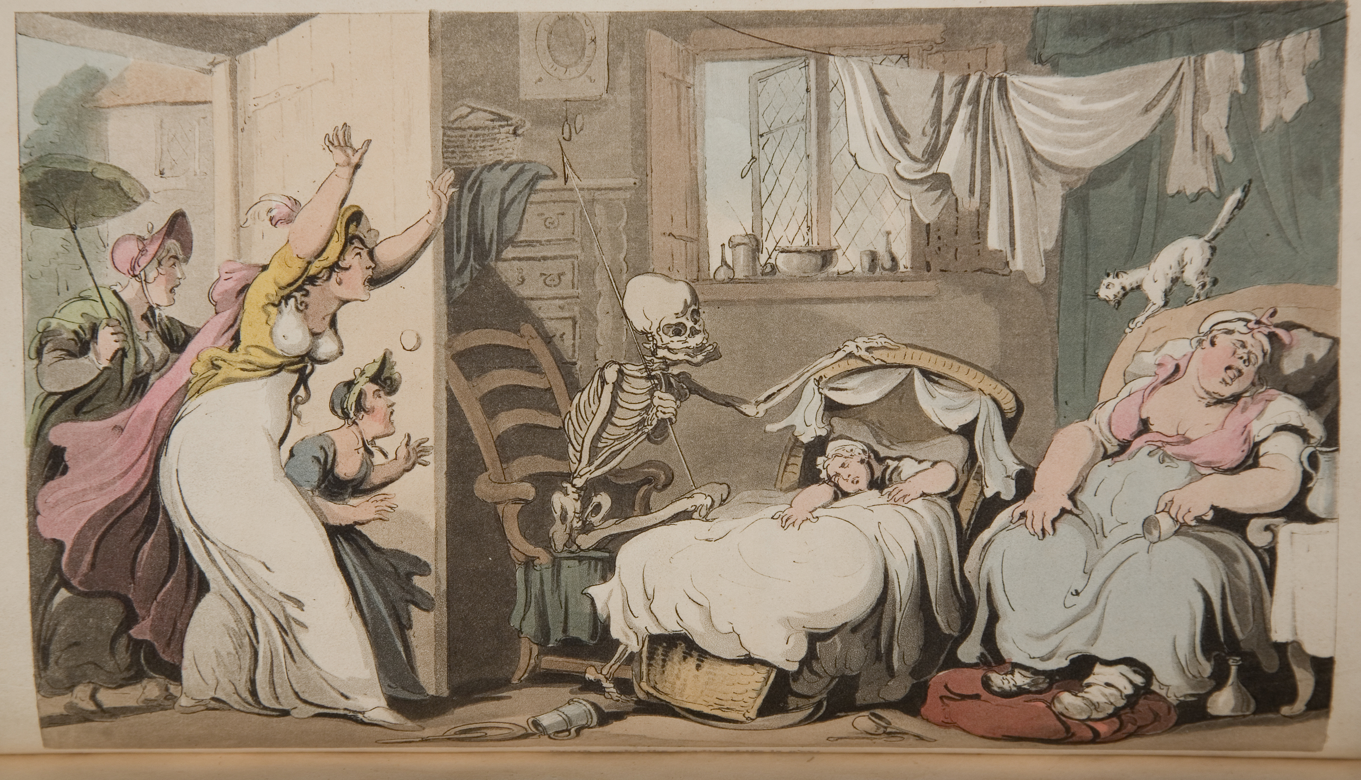
According to Brittanica the French term for comic art is bande dessinée or “drawn strip”. In German it is Bildergeschichte “picture story” or Bilderstreifen “picture strip”, in Spanish both the strip and book forms of comics are called historieta, and Japanese Manga or “whimsical pictures” are becoming more and more popular around the globe.
Many consider comic art to be a very new art form. Some experts even attribute the lack of recognition of older examples of comic art as part of the reason that it is not viewed as highly as other art forms of similar precedent. Comics, as we know them today, were first printed in 1933 and many agree that the Golden Age of comic books began with the printing of Superman in 1938. But if we think of comics as images with captions or dialogue they date much further back.
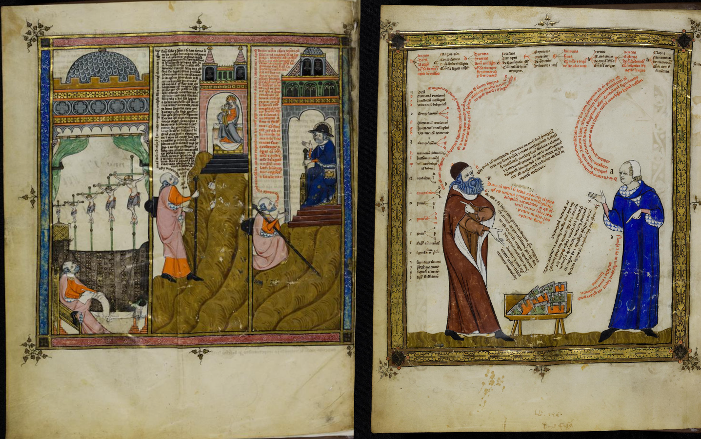
This 14th-century miniature cycle about Raimundus Lullus’ life and teachings has sequential panels and the text is incorporated into the illustrations. While the text is not in the kind of speech bubbles that we may recognize today, there are clear ‘tails’ or pointers on the ends of blocks of text that link the words to the speaking character. McCusker noted that the purpose and reputation of comic art has changed significantly since its inception. “One of the most important occurrences of serial narrative using the same characters was actually for religious art in the West.” She said, “that really emerges not very frequently with mythology even though that storytelling was central to the culture. But really with Christianity and with the importance of using images as teaching tools. So ironically, these things that were meant to be educational and edifying for people who could not read, for a populace that was mostly illiterate, now it’s been used for satire purposes and to tell stories in a very quick and clear sort of way.”
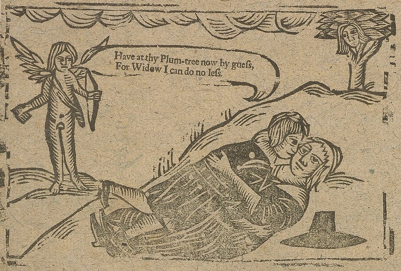
Working forward in time there are even more pieces that one might argue should be considered comic art. Some even include speech bubbles. The 17th-century woodcut above is from the English Broadside Ballad Archive and depicts two lovers in an embrace while a cherub sings. Notice that the lyrics to “He That Loves Best Must Suffer Most” are in a curling text bubble coming from the cherub’s mouth.
More recently, according to McCusker, 18th-century comics harnessed the art of satire and ridicule as a response to a changing society, “[William] Hogarth was using the art of satire in a contemporary way that you can even think of literary figures using that. Like Voltaire in Enlightenment France.” She describes that at this time in history “Satire sort of emerges as this way not just to poke fun but to actually point out failings of society or failings of certain members of society. Mostly, it was for him, certain members of society and often it was the elite, the nobility and the aristocracy as well.”
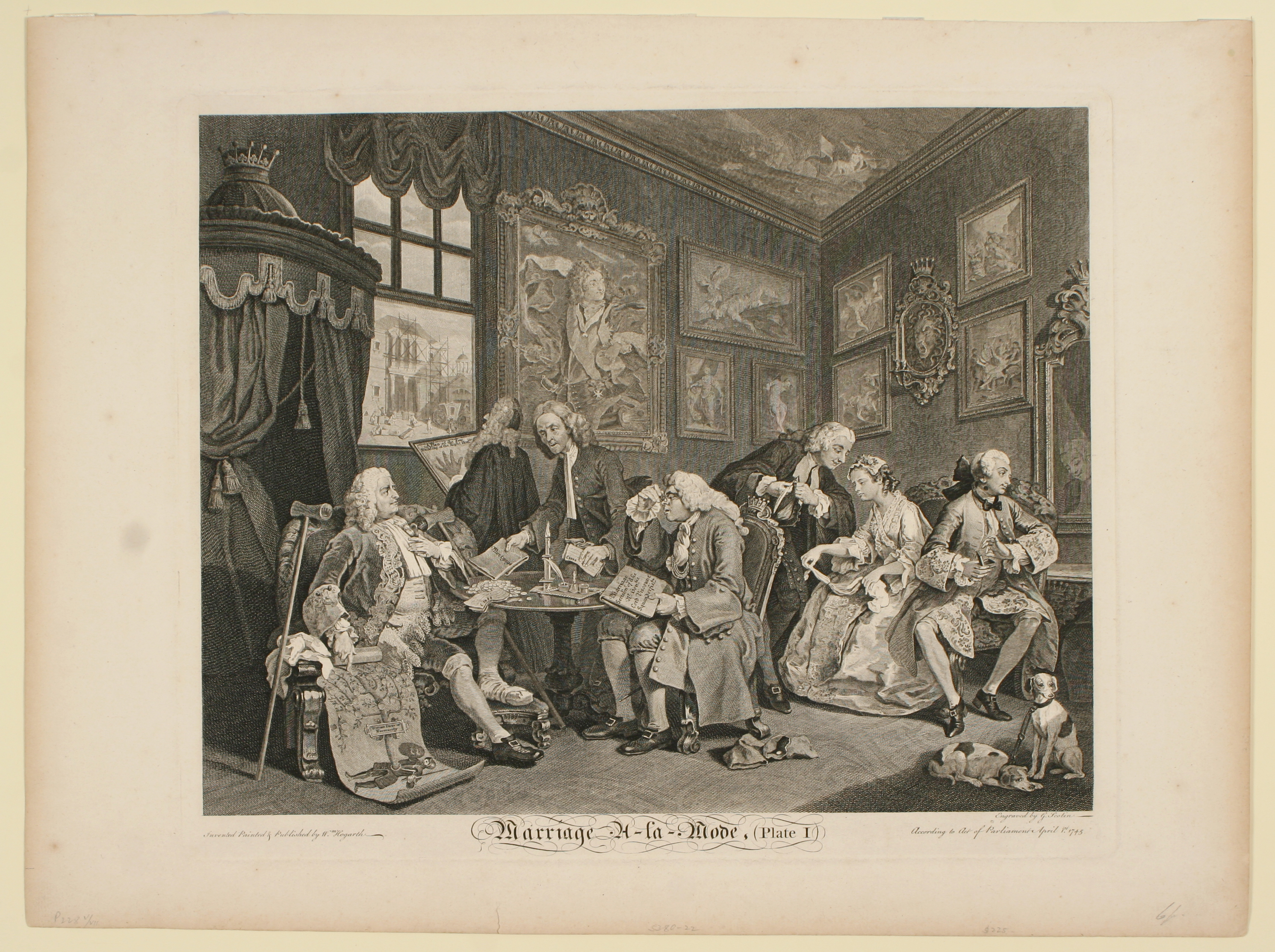
“One thing that [Hogarth] did that really influenced the comics that we see later on is to serialize the storytelling and to break it apart and to re-use the same characters. With Marriage A-la-Mode it’s this mocking of the institution of marriage among the aristocracy by pointing out like what were often clichés, but that did really happen.” In a six-part series the story “starts out with these cliched characters where this young woman is being forced to enter into this marriage as this family contract. And the man she’s marrying is a complete womanizer, and it sort of ensues and it becomes obvious that she becomes a partier during the course of this and they’re both unfaithful to each other. It just ends up kind of ridiculous. But one thing that [Hogarth] did was sort of serialize and tell a story with these clichéd characters that were so over the top that it was hard to miss the message. This was not an art of subtlety this was an art like sketch comedy-how over the top can you make a skit on SNL kind of. But what really was effective about it was when it really hit home.”
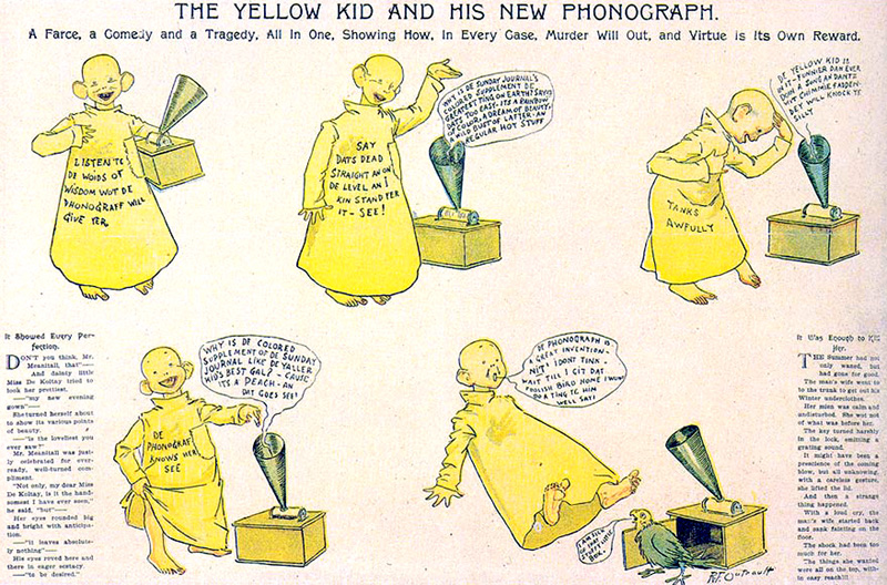
Most of us today think of comics as having multiple panels in sequential order rather than a single satirical illustration with a caption. Some of the first full-color comics with sequential panels were born out of a rivalry between the two American newspaper giants in 1894. Originally, Richard Fenton Outcault’s Yellow Kid comic followed the format of the time, a single-scene illustration with captions at the bottom that provided context or dialogue. Eventually though, Outcault’s style evolved to include sequential pictures and speech bubbles that were necessary to read to understand the story, adopting the style that is more familiar to a modern reader. While Yellow Kid certainly wasn't the first example of this modern comic style. It was the beginning of a mainstream trend of simplifying images and putting them in sequential order to convey the message.
Opinions abound when it comes to our original question. Are comics fine art? So, I consulted another expert. Allison Mower, librarian at the J. Willard Marriott Library, says comic art does qualify as fine art. In a correspondence interview she said “When I think of fine art, I usually think of painting, photography, and sculpture. Comics and graphic novels qualify, in my mind, given the use of illustrations and drawings plus original text and writing. It takes a certain degree of talent to be able to combine both forms of expression into a single work.”
Allyson Mower is an expert in copyright and authorship and has masters’ degrees in liberal arts and library and information science and a bachelor of art in American Studies. Mower consulted on the Third Saturday for Families comic-making activity that will be taking place June 15 at the UMFA. Mower said that though “I came around a little more slowly to comics and graphic novels. I have read several comics and graphic novels now for various book clubs and see them as unique and powerful works of authorship and art forms. I certainly see them as fine art and, from a copyright perspective, graphic novels represent highly creative works.”
McCusker, senior curator at the UMFA, agrees, “I do think comics are fine art. I think some of the most poignant things I’ve ever seen sometimes have been comics.” She says, “If they weren’t fine art how would they touch so many people? Why would they be so captivating?”
Some might argue that due to its text and narrative content, comics should be considered literature rather than traditional visual art. Mower said, “Books don’t often get considered as fine art generally, and since comics and graphic novels come in the form of a book, they might get overlooked as works of fine art.”
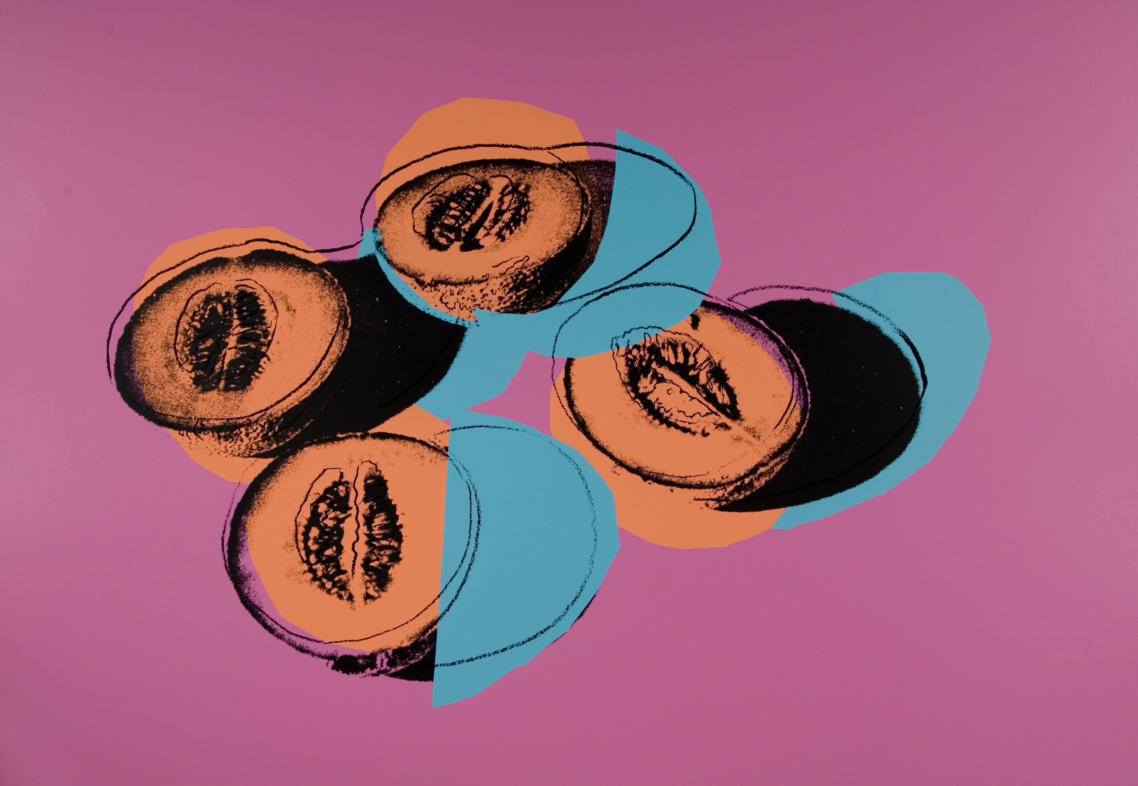
Another argument against comic art's inclusion in the definition of fine art is that it should be considered entertainment or that it is juvenile due to its audience and distribution methods. One might also notice that comic art is not in the ‘style’ of fine art or be of the same quality that is typically seen in a museum. But if you look at the pop art of Andy Warhol you can see aesthetics drawn from comic art in his work. In particular, in Space Fruit, Cantaloupes II, you can see bleed marks similar to those in mass-printed comic books where the color blocks don’t quite line up with the line art.
Ultimately, in the words of Mower, “Art conveys meaning and without it we would not be fully human nor would we be the people that we are in our modern-day society! Comic art is in that mix as a visual and textual form of expression and communication.”
While some may still disagree that comic art is fine art, the art form continues to evolve and find itself featured in more and more fine art institutions. Comic art is currently featured at the Utah Museum of Fine Arts in many ways. This connection is a testament to how different spheres of the art world are always in conversation. Visit the UMFA before June 30, 2024 to immerse yourself in the comic art on view, starting with Pictures of Belonging: Miki Hayakawa, Hisako Hibi, and Miné Okubo where you’ll find the early sketches that would later become Citizen 13660. Take time to relax and reflect in the interim Art Lounge in the ACME Lab and read Maus by Art Spiegelman, Gender Queer by Maia Kobabe, Drama by Raina Telgmeir, Persepolis by Marjane Satrapi, Captain Underpants by Dav Pilkey, and Fun Home by Alison Bechdel. If you’d like to try your hand at comic art, visit the UMFA for this upcoming Third Saturday for Families on June 15 and create a comic flip-book of your own!

